
4 common mistakes on LinkedIn profile pages
Read time: 3 minutes
Hi dear reader,
Even though I’m not a fan of social media, a marketing strategy would be unthinkable without one or two social media channels.
I focused on LinkedIn (600+ million users) for the past couple of years and like to share some must-do’s on your LinkedIn profile page.
Your LinkedIn Profile Page is not about you
It sounds a bit paradoxical, but your LinkedIn Page should be about the visitor.
Think of your profile as your sales page.
If I visit your page, I want to understand what you do, who you help, and what I can achieve when working with you or following you.
You probably have to alter some content on your page when you realize this.
Here are 4 common mistakes to avoid.
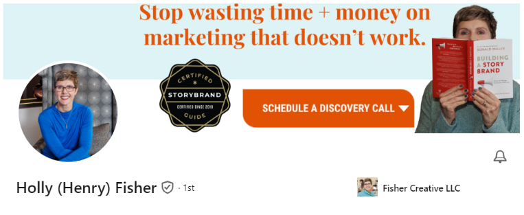
(1) Your banner image doesn’t say anything about you
Have you updated that grey background banner on your profile? This piece at the top is the first thing people will see when they land on your profile.
Holly Fisher (who has appeared on the Born to Fly podcast twice) shows a great way of utilizing the banner. It tells you what she offers and what you can do to get in touch.
(2) The tagline is something like: founder | marketing expert | dog mom
The majority of people have a tagline like this. It’s not bad, but it does not seize the opportunity you get here.
People’s attention spans are short and they would like to know instantly what you do. A tagline with 3 positions doesn’t tell me that.
A tagline should be clear and precise.
Two formulas that work:
The “Seth Godin”: What change do you seek to make?
The Curiosity-Inducer: What unique and interesting project are you currently working on and what can people expect if they give you a follow?
I like how Jason J. Fleagle did it:

(3) The Featured Section isn’t used
The Featured Section is where you direct people to your website. This space is ideal for referring people to subscribe to your newsletter, for example, or to show the book you wrote or the course you sell.
Tom Schwab, who is an expert on selling on podcasts, used this in his featured section. I like how he provides something valuable:

(4) The About Section is boooooring
Finally, a place where you can talk about yourself, so make it stand out.
Don’t give a summary of your resume. People can see down below what you’ve done in the past.
Give them helpful information instead that will convince them you are trustworthy for what you share on LinkedIn.
Tell them what drives you.
How did you come to the place you are now?
Share what you’d like to change in the world and what you believe in.
Invite people to your mission.
That will activate them and give them a chance to either want to follow you or don’t. Both are fine.
This is mine About Section:

I’m not saying it’s perfect, but it’s different and inviting.
Conclusion
With just a few adjustments, you can avoid the 4 mistakes mentioned.
Create a catchy banner
Make a clear tagline
Feature your work
Write something captivating in the About Section
The little time investment will surely pay off. People on LinkedIn will now know who you are and what you do and want to achieve when they visit your profile.
That’s a profile page that’s doing the work for you.
Blessings to you,
Jane
Want blogs like this in your inbox? Subscribe here.